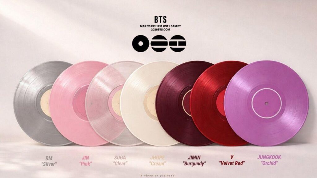
When BTS releases something new, we know: nothing is by chance. With the album ARIRANG, that’s confirmed once again. Seven BTS vinyl options, seven different colors, one thing in common: the vibrant red on the logo. But what do these colors say about each member? Coincidence or calculated symbolism?
If you’re ARMY, you already know every detail tells a story. And this time, BTS chose colors as a silent language to tell us who they are and what they feel in this comeback. Let’s dive into this historical and chromatic arc that seems to translate the soul of the group — and maybe ours too. Because each BTS ARIRANG vinyl was designed to tell a part of this story.
The importance of colors in the BTS universe
Since the early days, BTS has never treated colors as a mere aesthetic element. They are narrative. They are emotion translated into light and pigment. Just remember the melancholic blue in Namjoon and V‘s “Blue & Grey”, j-hope‘s “Blue Side”, the yellow and blue used as a far-from-coincidental narrative device in the MVs of the solo era and, of course, the purple that became the collective identity of BTS and ARMY!
Besides that, every release comes with a carefully built palette, because color is story and feeling:
- In “DNA”, yellow and blue are combined vibrantly. Yellow brings liveliness, while blue offers the counterpoint of real life.
- In “Spring Day”, blue and purple (in a lighter shade) talk to each other to create a melancholic, nostalgic tone about loss and friendship.
- “Save Me” comes in shades of green, in the hope that things will get better.
- “Danger” and “N.O” use the raw association of black and white to bring that tough hip-hop aesthetic.
- “Fire”, of course, is red.
Colors in the BTS universe work as a language of their own, a visual code that speaks to people around the world, crossing language barriers.
When we look at the seven ARIRANG vinyls, we’re not just seeing physical products. We’re seeing seven individual stories that intertwine in a bigger narrative.
And at the center of it all? Red.
The role of red: the heart of BTS’s new album, ARIRANG
Before we talk about the individual colors, we need to understand red — the color that unites all the others. Printed on the official logo of BTS’s new album, ARIRANG, red isn’t just an aesthetic choice. It’s the album’s pulse.
Red is raw passion. It’s also pain that burns. It’s the intensity of someone who has been through everything and decided to keep going anyway.
In Korean tradition, red carries deep layers of meaning: protection against evil, celebration, but also mourning and sacrifice. That’s why all seven BTS vinyls carry this red on the logo — a choice that unites diversity and identity.
In “Arirang” — the folk song that has crossed centuries carrying the pain and hope of the Korean people — red makes total sense. It’s the color of a broken heart that still beats. Of a memory that hurts but needs to be preserved. Of a flame that never fully goes out. It’s pain, yes, but it’s also resistance and struggle. It’s the story of those who feel deeply but never, ever give up.
Red unites the seven members like an emotional thread. While each BTS vinyl has its own unique color, the red logo on all of them reminds us: they are one. Seven parts of the same heart beating together.
A look at each vinyl of BTS’s new album and its connection to the members
Each member has their own version of the BTS vinyl in the ARIRANG release. Here’s what each color communicates. Now let’s dive into the individual colors. Each BTS vinyl was carefully chosen to reflect the essence of each one.
RM – Silver BTS vinyl: the mirror of the modern soul
RM’s silver vinyl is no ordinary one. It’s reflective, literally and metaphorically. Silver is the color that doesn’t absorb — it gives back. And that’s RM at his core: the leader who has always reflected not only the group’s light, but ARMY’s too.
Silver carries modernity and sophistication. It’s minimalist, elegant, timeless. RM, with his philosophical depth and his constant search to understand the world through art, finds a perfect representation in silver.
All of RM’s mixtape and album covers are artistic. If “RM” and “mono.” were minimalist in lines and colors, “Indigo” came in calm tones. “Right Place, Wrong Person” is a bit more colorful, but still elegant, just like the artist.
There’s also something vulnerable about silver — it shows everything, unfiltered. Just like RM has been over the years: transparent about his doubts, his inner struggles, his creative process as an artist and thinker. Silver doesn’t hide. It reveals with analytical clarity.
And when we think of “Arirang”, this song of resistance and identity, it makes sense that the group’s leader — the one who carries so much weight — is represented by the color that reflects all the others.
Jin – Pink: the tenderness that crosses the ARMY world
Jin‘s pink only surprises those who aren’t ARMY — after all, everyone knows he’s the self-proclaimed “princess” of this universe 😊.
Besides, pink is pure affection. It’s sensitivity owned with pride. It’s the courage to be sweet in a world that sometimes confuses tenderness with weakness.
Jin, the oldest member, has always had this fascinating duality: disarming humor and the emotional depth he reveals at the right moments. Pink captures exactly that, and it’s not childish at all, it’s romantic. It’s not fragile, it’s affectionate.
Pink is the color of cherished memories, the ones we keep with love even when they hurt a little. It’s a goodbye and a promise at the same time. It’s the “I’ll be back” whispered before leaving. And Jin, who gave us so many songs about longing and connection, like “The Astronaut” and “I’ll Be There”, carries this color like someone carrying a love letter in their pocket.
In the context of “Arirang” — a song about separation and the hope of reunion — Jin’s pink gains even more weight. It’s the affectionate memory that keeps the flame of waiting alive. It’s the heart that stays soft despite the distance.
If Jin’s pink BTS vinyl is affection, the next one takes us into the territory of total vulnerability.
SUGA – Clear: the honesty that cuts like glass
If you were expecting a black vinyl, you guessed wrong, because SUGA is never obvious. Besides, imagining Yoongi’s soul as “dark” is a common mistake.
SUGA’s clear vinyl is maybe the boldest choice of all. Because clear isn’t the absence of color — it’s total exposure. It’s saying: look through me and see everything.
SUGA has always been raw in his art. He doesn’t soften pain or romanticize struggle. From “The Last” to “Haegeum”, through “Daechwita”, he has always shown us his open wounds, his scars, his demons. Clear reflects that: the honesty of someone who decided not to hide anything anymore.
Clear is conscious vulnerability. It’s emotional clarity even when the truth hurts. It’s authenticity in its purest form — no filters, no masks, no compromises. For an artist who uses music as public therapy, as a way to process trauma and pain, clear makes total sense.
But clear is also crystal. It’s clean water. It’s the possibility of seeing through chaos and finding sharpness on the other side. And if “Arirang” is about collective memory and ancestral pain, SUGA reminds us: we can only heal what we dare to truly see.
j-hope – Cream: the light that warms without burning
j-hope’s cream is cozy. Like SUGA, he avoided the obvious and didn’t go for the vibrant, explosive yellow many would expect from our sunshine. It’s something softer, more mature. It’s the color of dawn, not noon. And that says a lot about Hoseok’s artistic evolution.
Between the radiant energy of “Hope World” and the dark introspection of “Jack in the Box”, j-hope showed us he contains multitudes — and not just the ones at his tour. Cream captures that perfect balance — it’s light, yes, but soft light. It’s warmth, but warmth that comforts, not consumes.
Cream is creativity without pretension. It’s emotional comfort. It’s the candle lit at the end of the day, the hot cup of tea in your hands, the hug that needs no words. And j-hope, despite all his energy, has always been exactly that for the group: an emotional safe harbor, the person who keeps everyone anchored.
There’s depth in cream. It’s a color that doesn’t compete for attention, but you miss it when it’s not there. Just like j-hope’s presence — essential, stabilizing, comforting. In the context of “Arirang”, cream represents the hope that persists. Not naive hope, but the mature, constant kind that says: I’m here. Throughout his solo journey after military service, j-hope said countless times that he was showing his more mature side. That’s what it’s all about.
While the cream BTS vinyl brings soft light, the next one raises the emotional intensity.
Jimin – Burgundy: elegant intensity
Burgundy is matured red. It’s wine. It’s passion that has aged and turned into something more complex, deeper, more interesting. And it’s absolutely perfect for Jimin.
Jimin is pure intensity — in dance, in singing, in the way he gives himself to his art. But it’s a sophisticated, controlled, expressive intensity. Burgundy captures that essence: it’s not screaming red, it’s red whispered with so much emotion that you feel it deep in your chest.
This color has already appeared in Jimin’s recent aesthetic, and he himself has mentioned liking it. A while ago, he released a silver earring with a detail in… burgundy, of course!
And it makes sense — burgundy is sensuality without vulgarity, emotion without melodrama, strength without aggression. It’s the color of someone who feels everything intensely but chooses how to express it, with intensity but without excess. Making their presence felt without needing to shout.
Burgundy is also theatrical. It’s the color of velvet curtains, of classic stages, of art that transcends time. For Jimin, who turns every performance into an emotional experience, who dances like someone telling secrets, burgundy is more than a color — it’s a statement of principles.
In the context of “Arirang”, Jimin’s burgundy can represent cultural passion, ancestral pride, a visceral connection to roots. It’s the color of someone who feels history in their blood and turns it into art.
From intense burgundy we move to another shade of red. V’s BTS vinyl speaks directly to his artistic soul.
V – Velvet Red: the romanticism that defies time
Velvet red. Just reading it, you can already feel the texture, right? And that’s exactly V’s magic — he doesn’t just see colors, he feels them.
V has always loved the vintage, the classic, the romantic. Old movies, film photography, jazz, art that carries the nostalgic weight of time. Velvet red translates that perspective perfectly: it’s the color of old movie theaters, of roses that last forever in paintings, of a love that seems to belong to another era.
But make no mistake — there’s modernity in Taehyung’s choice. Because this red isn’t just nostalgia, it’s a reimagining of it. It’s taking the classic and making it relevant, contemporary, alive. It’s the bridge between what was and what could be.
Velvet red is sensory. It’s romance with substance. It’s passion expressed in the details — in the way light hits fabric, in the melody that sticks in your head, in the carefully chosen word. For V, whose art is deeply sensitive and aesthetically refined, this color is like an extension of his soul.
Within “Arirang”, V’s velvet red celebrates beauty in tradition. It’s reverence for the past without getting stuck in it. It’s singing an old song with a new voice. It’s memory turned into timeless art.
Well, it’s V…
Jung Kook – Orchid (vibrant purple): the transformation still in progress
Orchid. An intense, vibrant purple, impossible to ignore. And that’s exactly how Jung Kook has been showing himself — a force of nature in constant transformation.
He’s no longer the shy maknae we met. He’s a complete artist, confident, who mixes vulnerability and strength in a fascinating alchemy. The orchid shade represents this phase perfectly — mature without losing intensity, bold without losing depth.
Purple, of course, carries the emotional weight of being OUR color, the most ARMY color in the world. But orchid specifically goes further — it’s purple with its own personality, purple that says: I am me, and that’s powerful.
Orchid is mystery. It’s rebirth. It’s the flower that grows under specific conditions, delicate but resilient. Jung Kook grew up before our eyes, and now he blooms in his most authentic form — complex, contradictory, completely fascinating.
In the context of “Arirang”, Jung Kook’s orchid represents a future that honors the past. It’s the new generation carrying the torch, turning tradition into innovation, singing old songs with a voice that echoes in the present and resonates into tomorrow.
*This is not an official HYBE/BTS image. It was made by fans.
BTS ARIRANG vinyl: seven colors, one story
When we put all the colors of BTS’s new album side by side — silver, pink, clear, cream, burgundy, velvet red and orchid — they tell a complete emotional journey.
Collecting all the BTS ARIRANG vinyls isn’t just owning seven versions of an album — it’s owning seven perspectives on the same collective emotion.
It starts with RM’s silver, modern and reflective. It passes through the tenderness of Jin’s pink and the crystal-clear honesty of SUGA’s clear. It finds balance in j-hope’s cream, intensity in Jimin’s burgundy, timeless romanticism in V’s velvet red, and projects itself into the vibrant future with Jung Kook’s orchid.
It’s an arc that goes from reflection to emotion, from vulnerability to strength, from memory to transformation. Seven stages of the same story — the story of BTS.
And at the center of it all, connecting every color, every story, every member: the red of the ARIRANG logo. The beating heart. The passion that unites. Proof that no matter how many different colors they are, BTS is — and always will be — one.
The colors of the ARIRANG vinyls aren’t merchandising. They’re visual storytelling. They’re BTS doing what they do best: turning every detail into art, every choice into narrative, every product into an emotional experience.
Because for them — and for us — nothing is random. Everything means something.
Nothing about BTS is random — not even the colors of the ARIRANG vinyls. They speak to the soul of each member, but also to ARMY’s.
Whichever BTS vinyl you choose, know that it carries not just a color, but a story, an emotion, a piece of the group’s soul. And you, have you picked your favorite color yet? What does it say about you? 💿💜
Comment below and share your theory with us!
Você também pode gostar desses:
 BTS BT21: Discover the fun and exciting world of the characters created by BTS
 TinyTAN – All About the 2025 Collab with McDonald’s and the New Happy Meal Toys
 Jungkook Calvin Klein: The Partnership That Took the Fashion World by Storm
 ARMY BOMB: What It Is, Every Version, How to Connect It and Where to Buy BTS’s Official Lightstick